Pobox: In love with logos since 1995!
Post categories

This article was originally published as part of the Pobox blog. Pobox was acquired by Fastmail in 2015.
After the last few posts talking about the modern times of email, I got a little nostalgic for the old days, and I took a walk down Pobox’s own memory lane of logos. I also roped Louis Clotman, our graphic designer, into commenting on each logo with a professional’s eye.

The original Pobox logo! I remember the thrill I got when I saw this appear in Wired magazine’s May 1995 issue. The logo that was born with the service would stay in use until 1998, and was created by Pobox founder Meng Weng Wong.
Louis said: Nice job, Meng. Simple and to the point.

From 1998 to 2004, we asked, “why chase your email, when it can chase you?” From the time when frames were the cutting edge of web design, to the time when the use of frames marked your website as badly in need of an update, this was the Pobox logo (and the jumping-off point for our sister service, Listbox.com, logo redesign, too.)
Louis said: Many email services combine the mailbox metaphor with a computer screen in their logo. I actually like this one. We had dropped the www from our logotype at this point, and the use of yellow added some much-needed color.


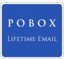
As we approached our 10 year anniversary, we changed our tagline to better show our devotion to all things email, and also to highlight our longevity. What’s the point of a lifetime email address if the service you’re using is only 9 months old? This era did have a “logo” of sorts, but the heart became emblematic of all things Pobox.
Louis said: Trajan was our logo typeface, which contrasted nicely with the sans serif on the rest of our homepage. If I had to select a logo from the past to refresh and reintroduce, it would probably be this one. It’s simple and classy.

And finally, the modern logo, which took that heart, and stamped it onto the icy world of email. It has stood through 2 different eras: the age of bicycles, and the age of philately.
And finally, the modern logo, which took that heart, and stamped it onto the icy world of email. It has stood through 2 different eras: the age of bicycles, and the age of philately.


Louis said: This was the first logo I got to design, and it took weeks of trial and error to get it right. We distilled the heart down to a frosty block and simultaneously arrived at “Pobox Blue” as our signature color, which you’ll recognize from the webmail user interface and the color of some of our links. Avenir has become our house typeface, and it combines with the logo to create a nice, clean effect.
This was the first logo I got to design, and it took weeks of trial and error to get it right. We distilled the heart down to a frosty block and simultaneously arrived at “Pobox Blue” as our signature color, which you’ll recognize from the webmail user interface and the color of some of our links. Avenir has become our house typeface, and it combines with the logo to create a nice, clean effect.
This logo is also great for situational tweaks. So, for your amusement, some variants of the Pobox logo: the technical staff in-house logo (designed by friend of Pobox Dan Hinder), the “zombie” logo and the greenscreen logo (for various email-related talks given by Pobox staffers.)


As one of the first pre-launch testers, my pobox.com email address is turning 15 this fall, and I remember the endless discussions that preceded each one of these logo changes. But one thing hasn’t changed over all those years – our true-blue love for all things email!
